Brand and press
Guidelines for a consistent, professional presentation of the Archie brand. For press enquiries, get in touch and we will help.
Get in touchWordmark
An editorial serif, set with restraint.
The Archie wordmark is the primary identifier. Set it in the display serif, never redraw or recolour it, and give it room to breathe.
The mark
One letter, the same serif.
The mark is a capital A cut from the same display serif as the wordmark. Use it where the full wordmark will not fit: the app, the favicon, avatars. It is drawn as a single shape and takes the colour of the text around it, so one file serves light and dark. Keep clear space around it equal to the height of its crossbar.
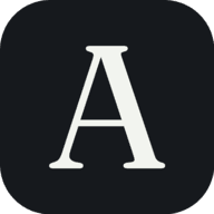
Left, the bare mark: the default everywhere, including inline next to type. Right, the boxed app icon: reserved for the home screen, the favicon and avatars, where a container belongs. Do not put the bare mark in a box of your own.
Palette
A minimalist greyscale.
Archie is charcoal, slate and grey on paper. The restraint is the point: the work is the colour, the interface stays quiet.
Press
Working on a story?
Get in touch and the team will help with assets, background and anything you need.
Get in touch